

 CONCEPT FRAMEPROPERTY BRAND (CONCEPT)01 / 04
VISION CRAFTERS
WE MAKE BRANDSIMPOSSIBLE TO IGNORE.
For founders whose work outclasses their reputation. We close the gap between how good you are and how the market reads you.
- BRANDING
- REELS
- ADS
- WEBSITES
- SOCIAL
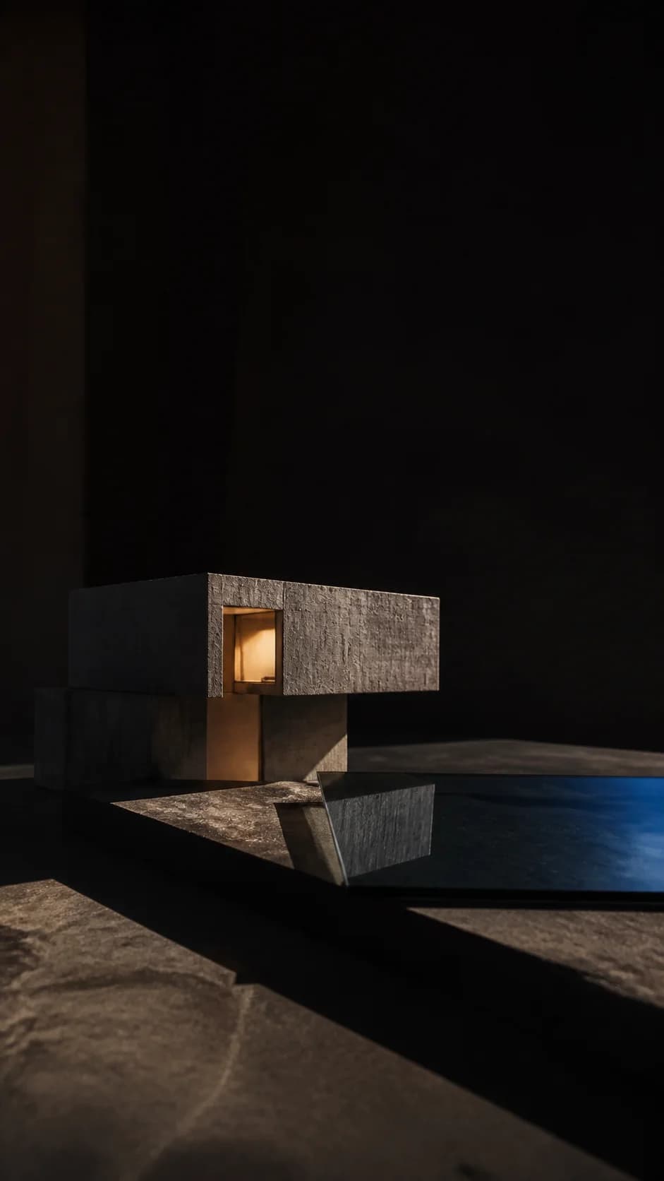
The hero page is drawn through a hole, revealing selected work beneath.
IMPACT
CONCEPT FRAMEPROPERTY BRAND (CONCEPT)01 / 04

01 / 04
PROPERTY BRAND (CONCEPT)
A page built to end in a booked call.
WEBSITE / CONVERSION / SEO
A campaign-page study on turning attention into a single clear action.
CONCEPT STUDY: SELF-INITIATED, NOT A CLIENT ENGAGEMENT
START A PROJECT ↗⟶ REELS & CONTENT PACKS
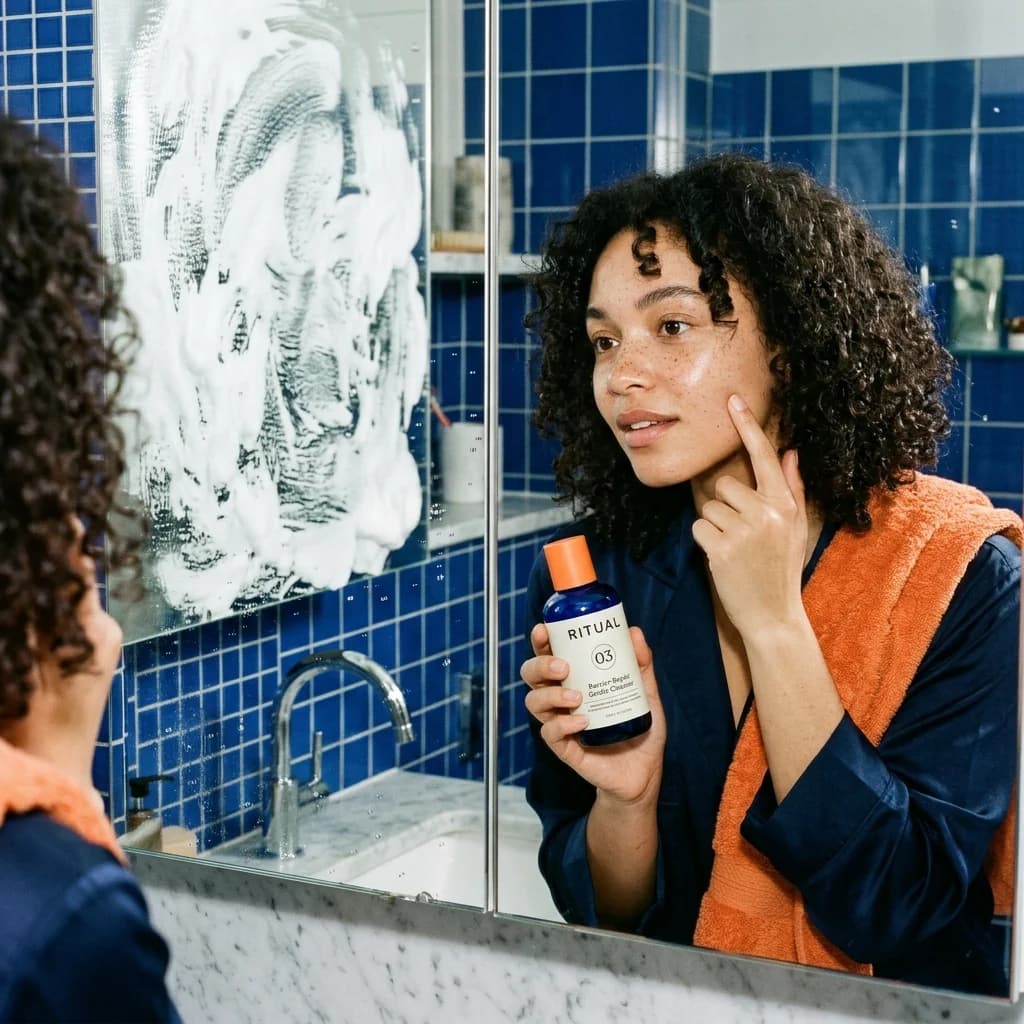
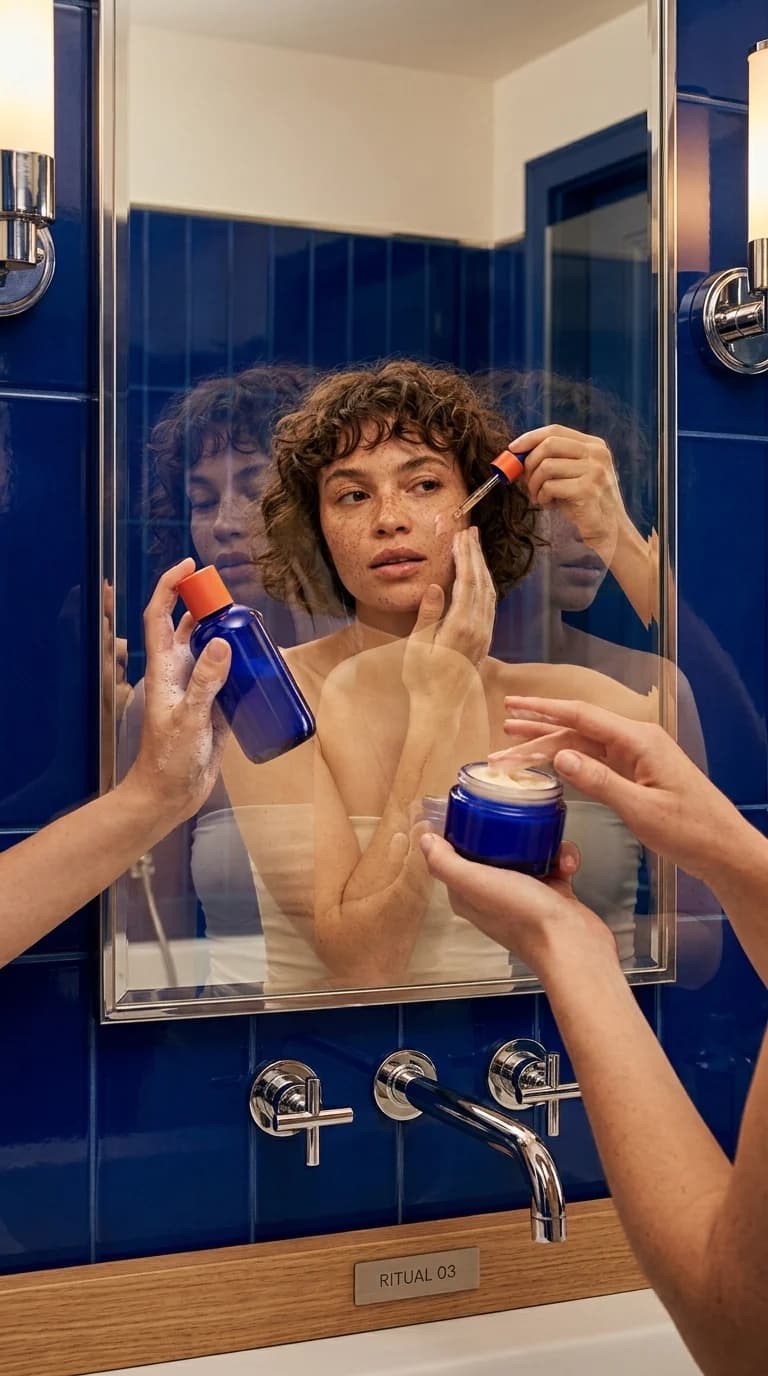
ONE SHOOT. WEEKS OF CONTENT.
One production day, planned properly, becomes a full library: hooks, statics, covers, stories, reels, and carousels. All from the same shoot.
01HOOKS
 The mistake wrecking your skin barrier
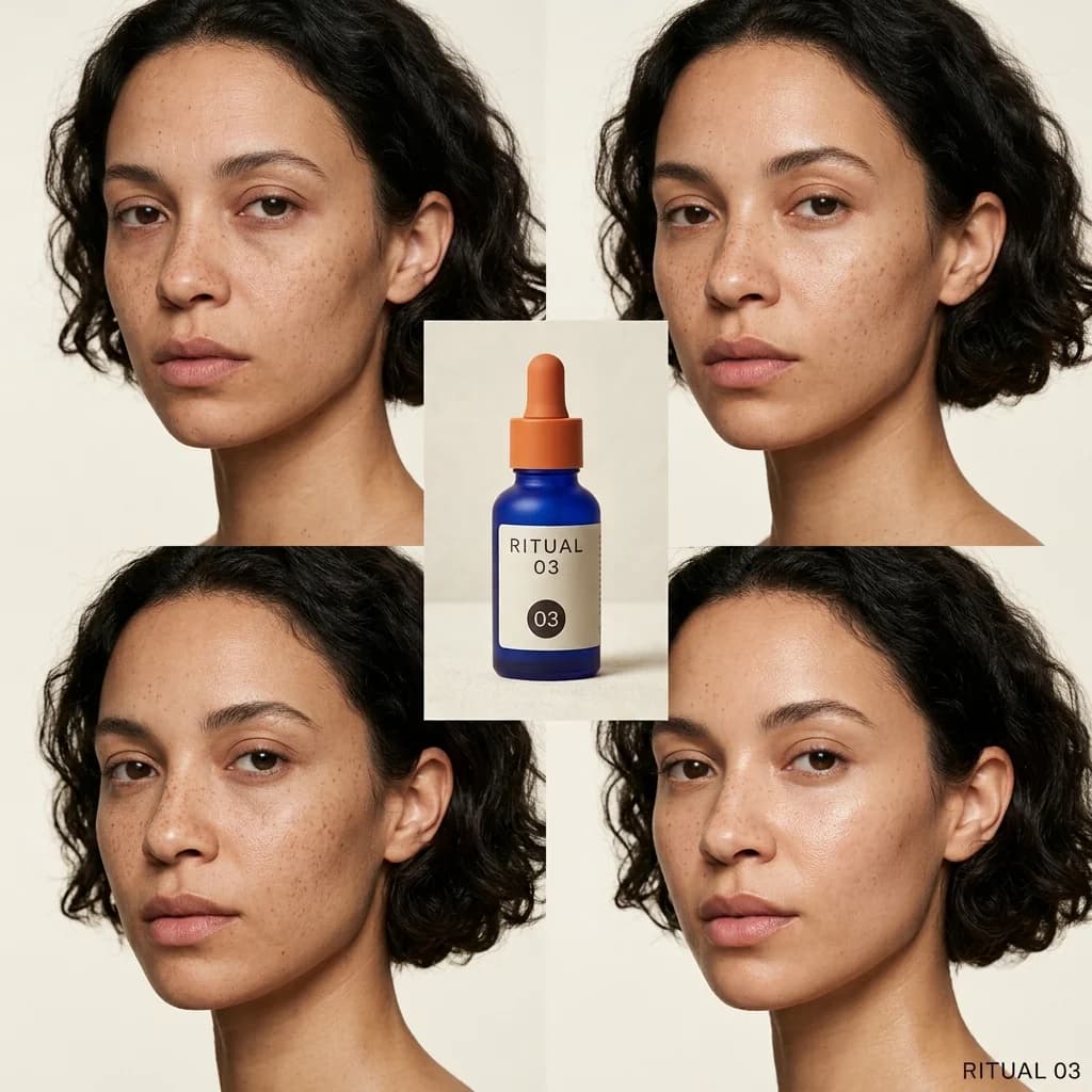 I tried it for 14 days
 What dermatologists skip over
02STATIC POSTS
 Ingredient breakdown
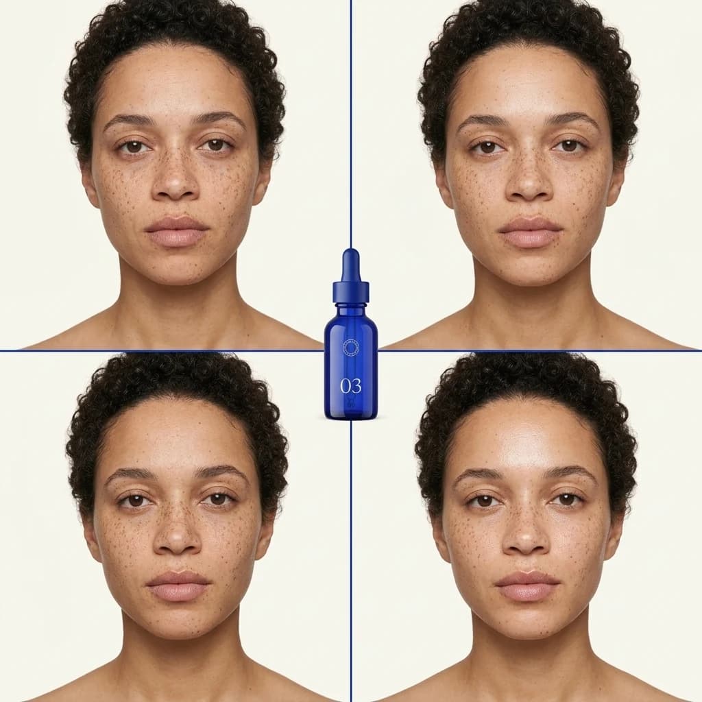 Before / after grid
 Price vs the clinic
03COVERS
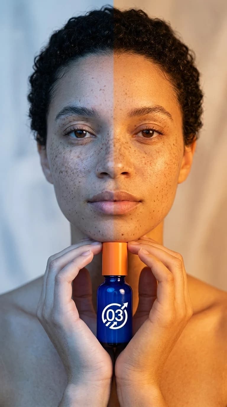 Day 1 vs Day 14
 What's actually inside
04STORIES
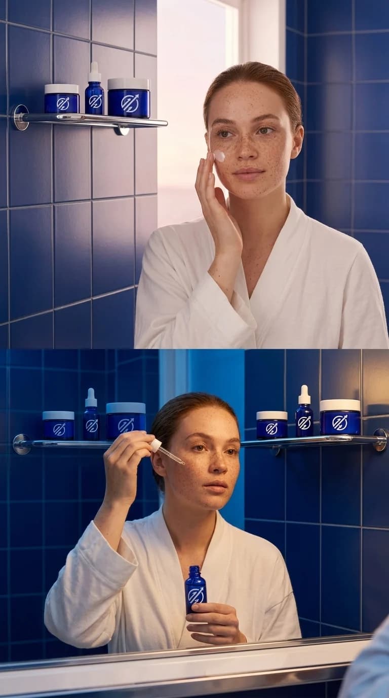 Poll: AM or PM routine
 Countdown: restock drops Friday
 Swipe to shop
05REELS
 60-second routine
 The founder's why
 Texture in slow motion
06CAROUSEL PAGES
 How to layer it
 The 3-ingredient science
 Real results
 How to order
ONE SHOOT
⟶ WHAT WE MAKE
STRATEGY YOU CAN ACTUALLY SEE.
- 01BRAND SYSTEMS
- 02REELS
- 03CONTENT PACKS
- 04ADS
- 05CAMPAIGN PAGES
- 06SOCIAL FORMATS
⟶ THE LIBRARY
WORK THATKEEPS MOVING.
A rotating cut of campaigns, reels, pages, and social systems. Start with the featured work, then open the full library.
OUR CASE STUDIESVISION CRAFTERS / SELECTED WORK
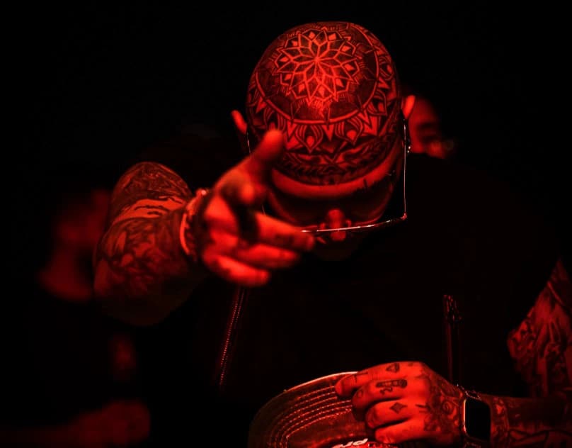
01Marked Portraits
01 / 12
Marked Portraits
PORTRAIT / PERSONAL WORK
A close portrait series built around tattooed skin and the people wearing it. The images keep the frame near, letting ink, texture, and expression carry the work.
APPROACHClose framing, direct portraits, and a restrained edit.
READ CASE STUDY ↗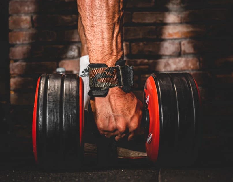
02Training in Motion
02 / 12
Training in Motion
FITNESS / PHOTOGRAPHY
A study of training, bodies, and the repetition behind a session. The photographs move between action and stillness to keep the work physical without over-staging it.
APPROACHAvailable light, close crops, and a focus on movement.
READ CASE STUDY ↗
03Street, Unscripted
03 / 12
Street, Unscripted
DOCUMENTARY / PERSONAL WORK
An observational street series made from small gestures, passing light, and ordinary scenes. The edit stays simple and lets timing do most of the work.
APPROACHPatient observation, natural light, and an unforced edit.
READ CASE STUDY ↗
04Portrait in Restraint
04 / 12
Portrait in Restraint
PORTRAIT / EDITORIAL
A compact portrait series built from controlled poses and close framing. The images keep attention on the subject and avoid adding decoration that the work does not need.
APPROACHSimple direction, considered framing, and a quiet colour treatment.
READ CASE STUDY ↗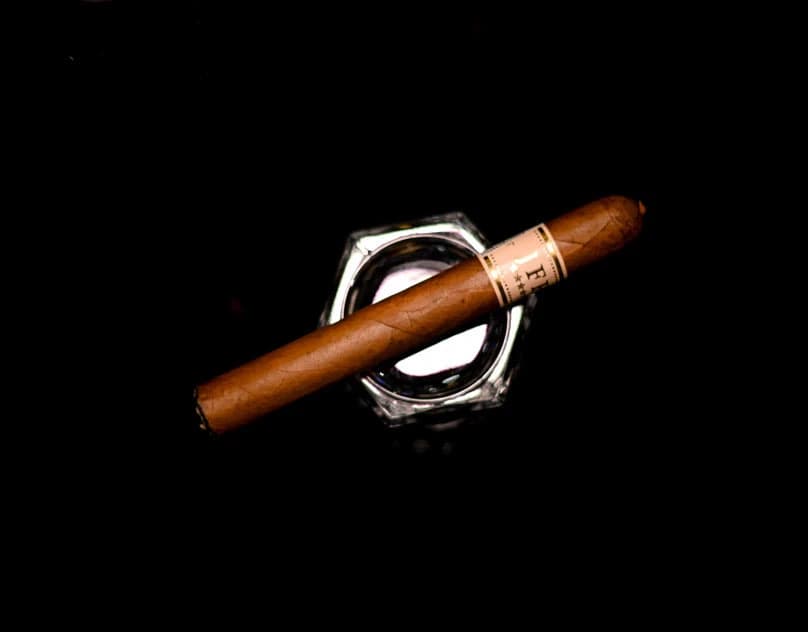
05Damascus, Observed
05 / 12
Damascus, Observed
PLACE / DOCUMENTARY
A place-led series from Damascus, focused on streets, buildings, and everyday details. The photographs hold onto texture and atmosphere rather than trying to turn the city into a backdrop.
APPROACHObserved details, natural light, and an atmospheric sequence.
READ CASE STUDY ↗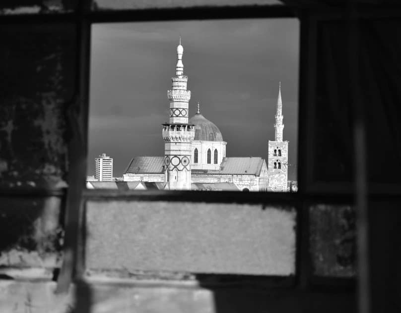
06Care / Short Film
06 / 12
Care / Short Film
SHORT FILM / EDIT
A short vertical video piece built around movement, pace, and a close personal point of view. It is edited as one complete sequence rather than a collection of disconnected shots.
APPROACHDirect pacing, vertical composition, and a clean cut.
READ CASE STUDY ↗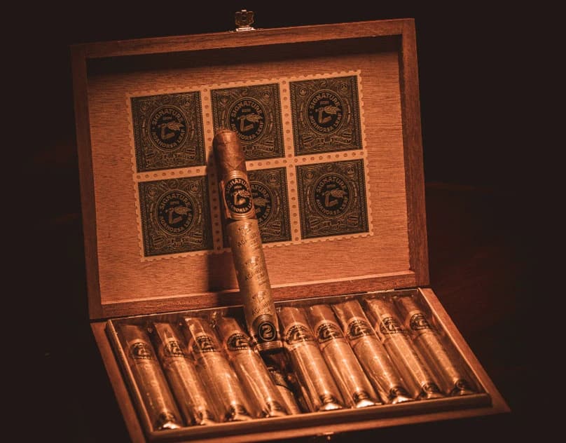
07Cigar: Light and Material
07 / 12
Cigar: Light and Material
PRODUCT / STILL LIFE
A cigar photography set working with smoke, texture, and controlled light. The mood comes from shadow and material, keeping the subject tactile and grounded.
APPROACHDirectional light, material detail, and restrained styling.
READ CASE STUDY ↗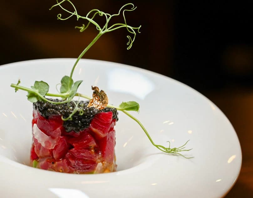
08Food, Framed
08 / 12
Food, Framed
FOOD / COMMERCIAL PHOTOGRAPHY
A broad food photography series covering plated dishes and ingredients. The approach stays close and clear, using light, colour, and texture to make each frame feel immediate.
APPROACHClean compositions, natural colour, and detail-led framing.
READ CASE STUDY ↗
09Cigars: Product and Atmosphere
09 / 12
Cigars: Product and Atmosphere
PRODUCT / COMMERCIAL PHOTOGRAPHY
A second cigar-focused series with a more product-led treatment. Detail, packaging, and atmosphere are balanced so the images can work as a set or as individual commercial frames.
APPROACHProduct detail, warm light, and a consistent visual rhythm.
READ CASE STUDY ↗
10Crystal in Light
10 / 12
Crystal in Light
PRODUCT / COMMERCIAL PHOTOGRAPHY
A premium product photography project for Nachtmann and Spiegelau crystal glassware. The work focuses on clarity, reflections, and the small details that communicate quality.
APPROACHControlled lighting, clean compositions, and careful styling.
READ CASE STUDY ↗
11Gulan Mall: A Flexible Identity
11 / 12
Gulan Mall: A Flexible Identity
IDENTITY / GRAPHIC DESIGN
A compact identity study for Gulan Mall, built around a bold wordmark and a simple graphic symbol. The system is direct, legible, and designed to hold its shape across the main brand applications.
APPROACHStrong typography, a clear mark, and a limited colour system.
READ CASE STUDY ↗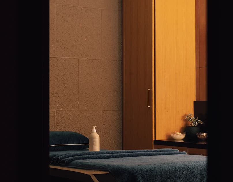
12Divan Spa: Hospitality in Frame
12 / 12
Divan Spa: Hospitality in Frame
HOSPITALITY / PHOTOGRAPHY
A hospitality image set for Divan Erbil, using food, drinks, and the surrounding atmosphere to show the place as it feels to visit. The photographs are warm, quiet, and easy to read.
APPROACHAmbient light, selective focus, and a relaxed hospitality edit.
READ CASE STUDY ↗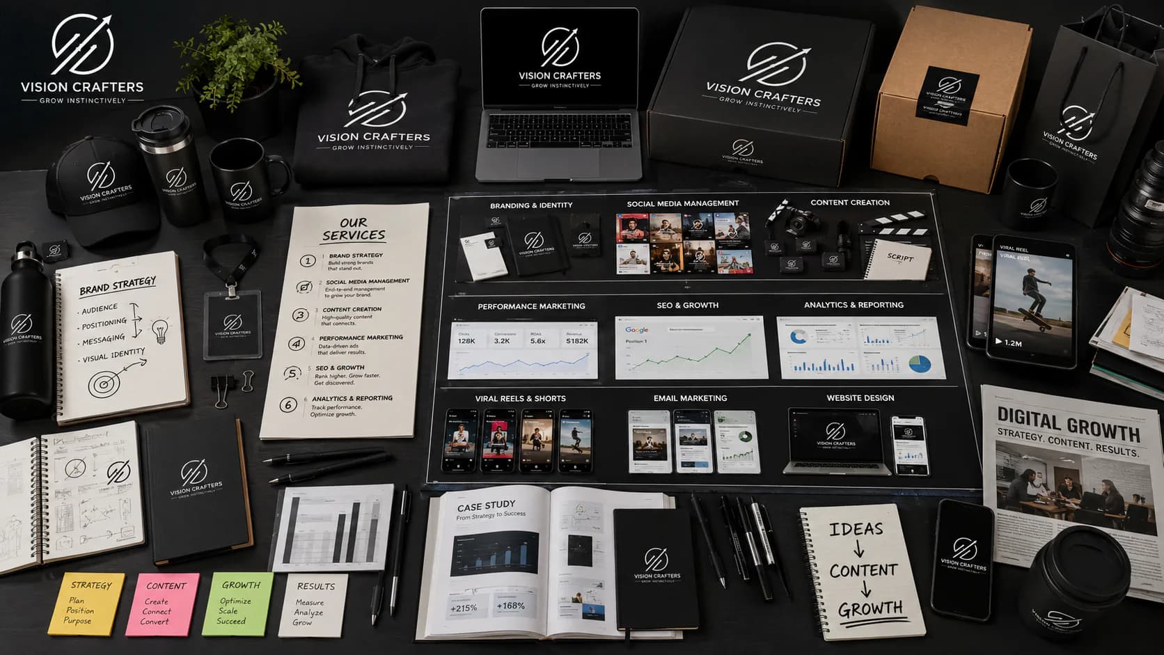
⟶ HOW WE THINK
WE DESIGN FOR THE DECISION, NOT THE AWARD.
Most studios sell decoration. We start with the commercial job: what has to change for someone to choose you, then make it impossible to ignore. The look is the last decision, not the first. That's why the work still performs after the launch buzz fades.
- Strategy before style.
- Clarity over cleverness.
- Ship, then sharpen.
- Nothing on the page without a job.
⟶ START HERE
START WITH THE REAL PROBLEM.
Tell us what you're launching or changing, and what's getting in the way. A real person reads every message and replies.
VISIONCRAFTERS